
Government
Mobile UX
Redesign
UX DESIGN / UX RESEARCH / INFORMATION ARCHITECTURE
Improving access to high priority services on mobile
Government websites are often the first stop for time sensitive, high stakes tasks such as renewing licenses or replacing identification. This case study explores how a mobile first redesign can better support users by prioritizing the services they need most.
DATE
—
November 2025 Conceptual Redesign
ROLE
—
UX / UI Designer, Information Architecture
DELIVERABLES
—
Mobile Website Redesign (Task First UX)
TOOLS
—
Figma, FigJam, Photoshop, Illustrator
01
{ THE CHALLENGE }
The Santa Ana DMV mobile website does not reflect the urgency and intent behind most user visits. While the desktop experience surfaces key services more clearly, the mobile homepage prioritizes breadth over task relevance.
On mobile, critical actions are buried within dense navigation, forcing users to scroll, search, or guess where to begin; even for time sensitive services.
When users visit the Santa Ana DMV site on mobile, they often:
Struggle to locate high priority tasks quickly
Spend unnecessary time navigating menus
Experience frustration when trying to complete simple actions
Design Challenge:
How might we redesign the Santa Ana DMV mobile homepage to surface high priority services immediately, without overwhelming users with unnecessary options?
02
{ WHY THIS MATTERS }
DMV services are time sensitive and often legally required. Delays in accessing the right service can result in penalties, missed deadlines, or disruptions to daily life.
For mobile users (many of whom are on the go or under time constraints), poor task prioritization increases friction at moments when clarity is most important.
This led me to focus on task prioritization, clarity, and accessibility, rather than adding more features or visual complexity.
03
{ MY ROLE }
I led the UX design process for this conceptual government redesign, including:
Auditing the existing desktop and mobile experiences
Identifying high priority user tasks through research and analysis
Defining a task first information hierarchy for mobile
Designing a streamlined mobile homepage experience
Creating high-fidelity UI to support clarity and accessibility
04
{ THE SOLUTION }
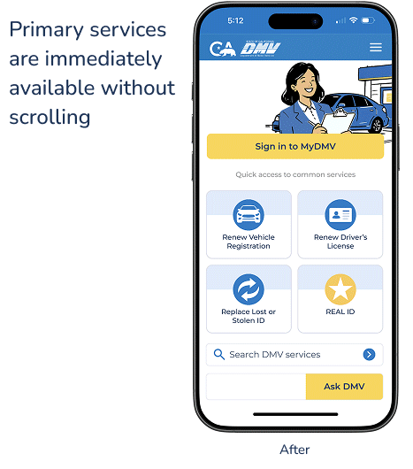
I redesigned the Santa Ana DMV mobile homepage with a single goal: to surface high priority services immediately and reduce friction for users completing time sensitive tasks.
The new experience prioritizes the four most common user actions at the top of the homepage, minimizes unnecessary navigation, and creates a clear entry point for mobile users. Secondary services remain accessible but are visually deprioritized to reduce cognitive load and support faster decision making.
05
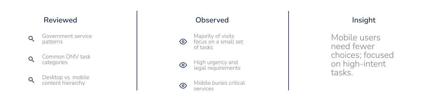
{ RESEARCH & INSIGHTS }
To understand what users most commonly visit government websites for, I reviewed publicly available government service patterns, common DMV task categories, and the content hierarchy across desktop and mobile experiences.
This research revealed that a small set of services account for the majority of visits, yet these high frequency tasks were not consistently prioritized on mobile.
Key Insight:
Mobile users need fewer choices, and those choices must reflect the highest intent actions.
06
{ TASK PRIORITIZATION }
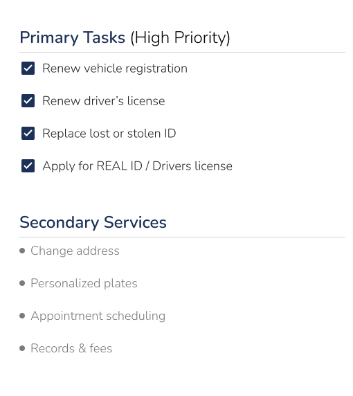
Based on research and observed usage patterns, I identified four high frequency, high priority actions that should be immediately accessible on mobile:
Renew vehicle registration
Renew driver’s license
Replace lost or stolen ID
Apply for REAL ID or driver’s license
These tasks are:
Time sensitive
Legally required
Common reasons for DMV site visits
By prioritizing these actions, the mobile homepage can better support users’ primary goals without overwhelming them.
07
{ EXISTING EXPERIENCE AUDIT }
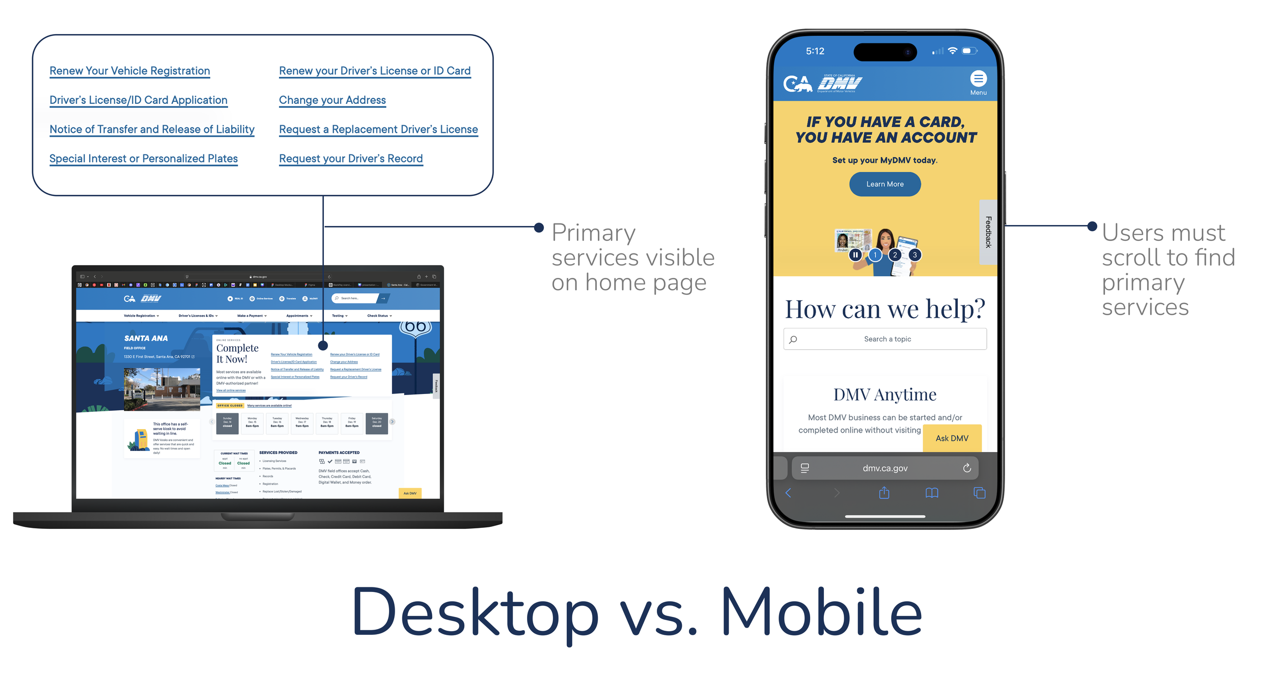
An audit of the existing website revealed a disconnect between desktop and mobile experiences.
On desktop:
Primary services are clearly visible
Navigation supports quick access to key tasks
On mobile:
Critical actions are buried within secondary navigation
Users must scroll or explore to locate essential services
Visual hierarchy does not reflect task urgency
08
{ DESIGN PRINCIPLES }
The redesign was guided by four core principles:
Task first hierarchy: Prioritize high intent services about all else
Reduce cognitive load: Limit choices to what users need most
Mobile first design: Optimize for one handed use and small screens
Clarity over completeness: Not all services require equal visibility
09
{ THE REDESIGN }
I redesigned the Santa Ana DMV mobile homepage with a single goal: to surface high priority services immediately and reduce friction for users completing time sensitive tasks.
The new experience prioritizes the four most common user actions at the top of the homepage, minimizes unnecessary navigation, and creates a clear entry point for mobile users. Secondary services remain accessible but are visually deprioritized to support faster decision making.
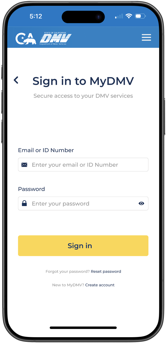
Sign On Page
The sign in screen was intentionally kept minimal to reduce friction at a critical moment in the user journey, prioritizing clarity and security over decorative elements.
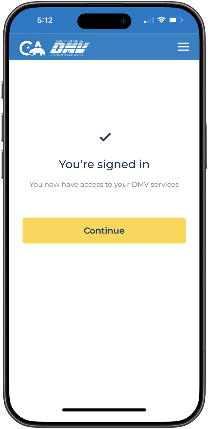
Post Sign On Page
A lightweight post sign in confirmation was added to provide system feedback and reassure users before returning them to the homepage.
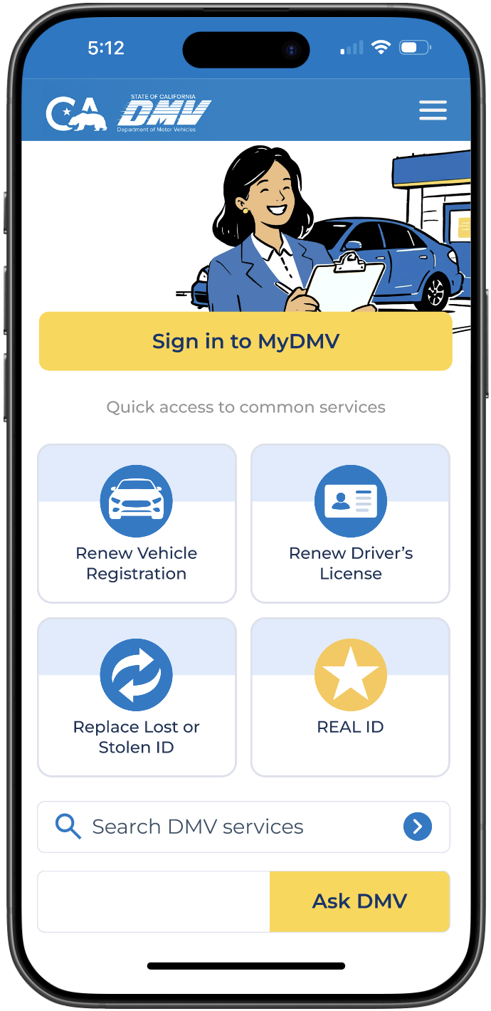
Home Page
The mobile homepage focuses on high frequency DMV tasks, surfacing essential services up front to help users complete actions quickly without unnecessary navigation or cognitive overload.
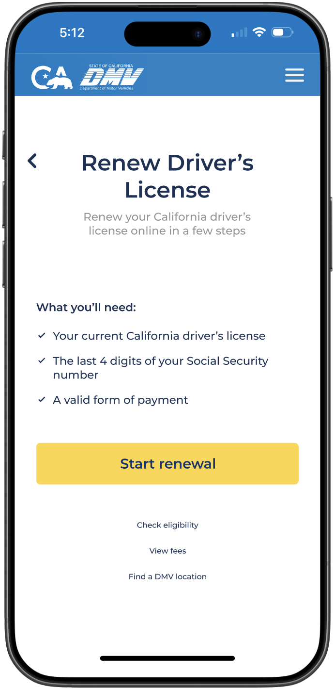
Renew Driver’s License
A service start page was designed to clearly outline requirements and set expectations before users begin the license renewal process. This design process would be implemented for all service pages.
10
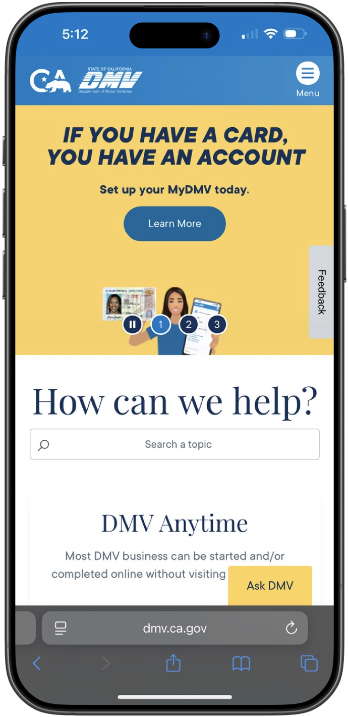
{ BEFORE / AFTER }
By restructuring the mobile homepage around high priority tasks, the redesigned experience reduces scrolling and makes essential services immediately accessible.
Before
Santa Ana, California DMV mobile homepage before
After
Santa Ana, California DMV mobile homepage after
11
{ REFLECTION }
What I Learned
Clarified how unclear hierarchy on mobile directly increases cognitive load
Learned how non actionable content above the fold delays task completion
Strengthened my ability to prioritize user intent over institutional messaging
Reinforced the importance of reducing unnecessary scrolling in time sensitive experiences
Improved my approach to structuring task first mobile navigation
What I’d Improve Next
Validated task prioritization through usability testing and time-to-task metrics
Test first click confidence to confirm clarity at the point of entry
Explore personalization of location-aware services to further streamline access
Measure the impact of reduced scroll depth on task completion and satisfaction