
An App to Help Users Remember
I built an app to solve a problem I deal with all the time; forgetting things when I’m rushing out the door.
This is how Forget Me Not came to be.
MY STARTING POINT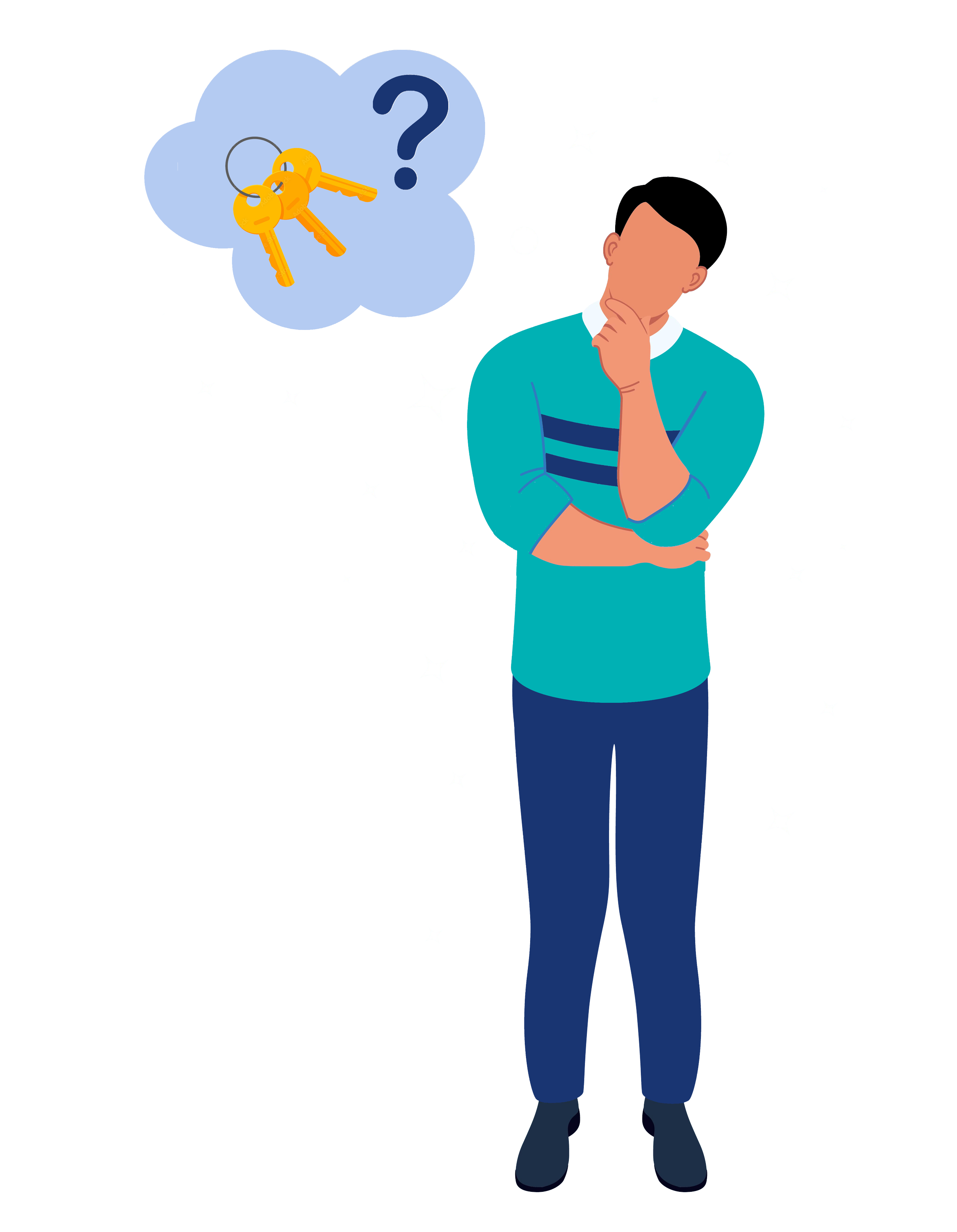
I started with questions.
Why do people forget things even when they care? Why does it happen during rushed moments? Why don’t reminders work when we’re already overwhelmed?
I paid attention to my own habits and the people around me. Forgetting almost always happened at the same time; right before leaving.
Not because we didn’t know what we needed. But because our attention was already somewhere else.
THIS ISN'T JUST MEBefore moving forward, I wanted to make sure this wasn’t just my personal problem.
I looked at articles, studies, and user behavior around memory, reminders, and daily routines. The same patterns kept showing up.
Forgetting everyday items is extremely common. Research shows that over half of people forget things like keys, phones, or wallets at least once a week. The causes are consistent: multitasking, stress, and rushed transitions.
I also looked at how people feel about the tools meant to help them. In a 2023 Pew Research study, nearly 80% of users said they are concerned about apps tracking their location. That told me people think carefully about how much control they give to technology.
01
{ THE CHALLENGE }
People often forget everyday essentials during rushed transitions out of a space. Existing solutions rely solely on notes, alarms, or GPS tracking, which fail to support users at the moment that matters most.
02
{ WHY THIS MATTERS }
Forgetting an item creates stress, delays, and unnecessary adjustments throughout the day. These moments compound mental load before the day even begins and throughout the day.
03
{ MY ROLE }
Product concept and UX strategy
Interaction design and user flows
UI design and prototyping in Figma
Onboarding, list management, and sensor experiences
UX/UI Designer
04
{ THE SOLUTION }
Create personalized reminder lists
Assign reminder times
Choose voice or text notifications
Link lists to a door motion sensor
Physically check off items before leaving
Forget Me Not allows users to:
The door motion sensor remains active within five minutes before, during, and after the scheduled reminder, ensuring alerts trigger even if a user leaves early or late.
05
{ RESEARCH & DISCOVERY }
Rather than heavy competitive analysis, this project focused on behavioral patterns.
Forgetfulness increases during context switches
Notification overload causes reminder fatigue
Users distrust constant location tracking
Physical confirmation improves memory recall
Key Research Insights:
These insights informed timing, interaction patterns, and privacy decisions.
06
{ PERSONAS }
To keep the product focused, two personas guided decisions:
• Leo, the Neurodivergent Student
Benefits from structure and reduced cognitive load
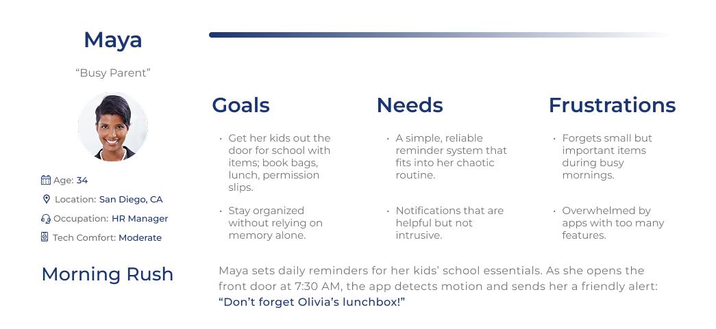
• Maya, the Busy Parent
Leaves home rushed and multitasking
07
{ KEY DESIGN DECISIONS }
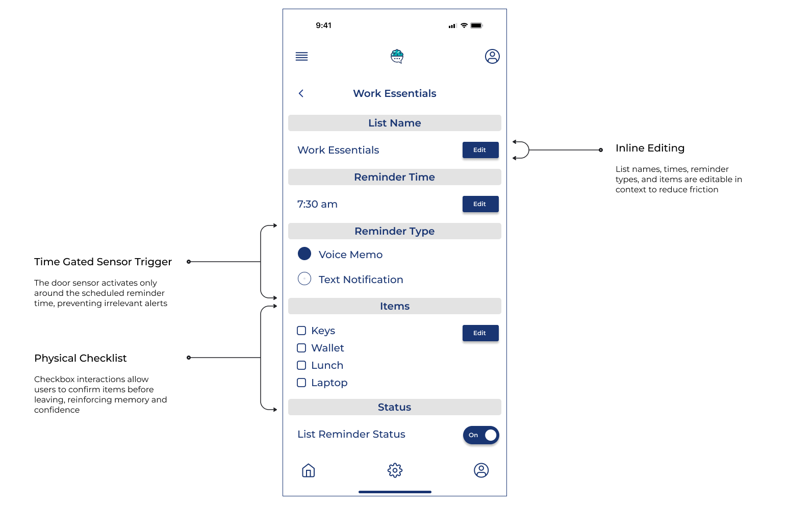
Time Gated Sensor Triggers
The door sensor only activates during user defined reminder windows to prevent irrelevant notifications.
No GPS Tracking
Motion based triggers provide contextual awareness without surveillance
Inline Editing
List names, times, reminder types, and items are editable in context to reduce friction
Physical Checklists
Checkbox interactions allow users to confirm items before leaving, reinforcing memory and confidence
08
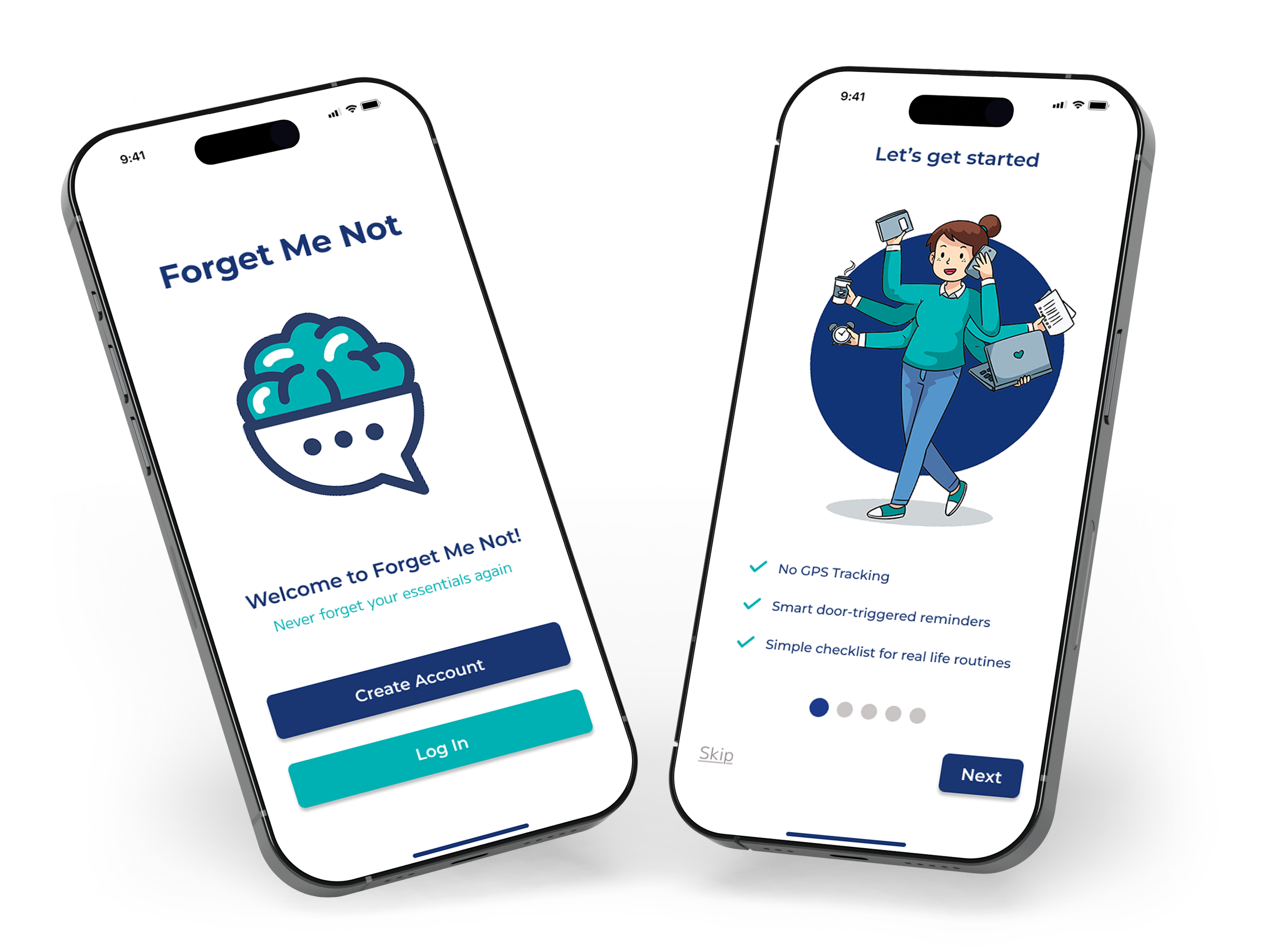
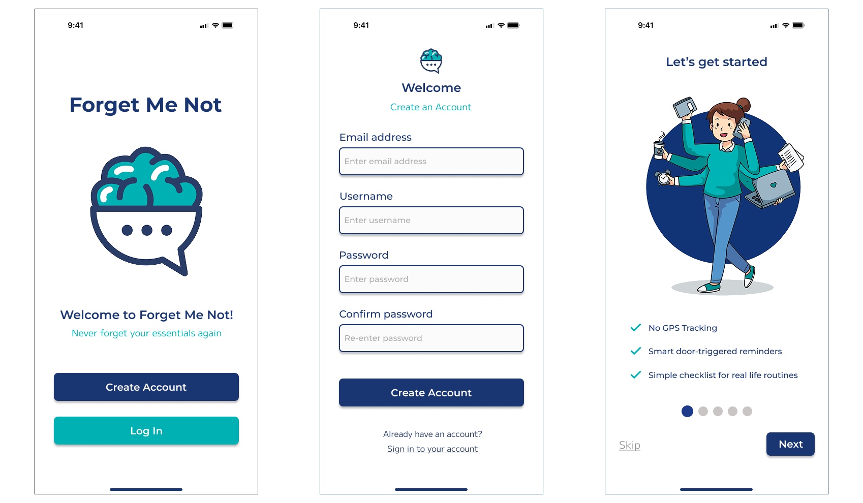
{ ONBOARDING }
Onboarding introduces the core value of Forget Me Not while giving users the option to start immediately or explore the app first. Users can set up their first list right away or skip onboarding and configure reminders later.
09
{ THE FORGET ME NOT EXPERIENCE }
Forget Me Not helps users prevent everyday forgetfulness through a smart reminder system that detects when they are leaving the home and delivers timely alerts without relying on GPS tracking.
Users Can:
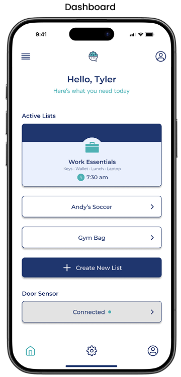
Quickly view and edit reminder lists and door sensor status from the dashboard
Edit items within existing lists
Rename existing lists
Change the reminder time for existing lists
Dashboard Options
Edit Reminder List
Edit List Name
Edit Reminder Time
10
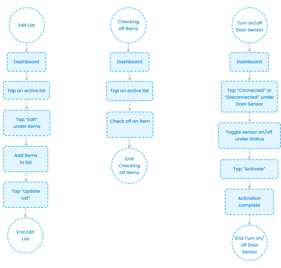
{ USER FLOWS }
I designed these flows to feel light and effortless, knowing that users often interact with Forget Me Not while rushed or distracted. Every step is intentional, so users can complete tasks quickly without needing to stop and think.
Key Flows Include:
Editing reminder lists
Checking off list items
Turning off/on door sensor
11
{ WIREFRAMES }
Low-fidelity wireframes helped validate hierarchy, reduce clutter, and test inline editing patterns.
12
{ FINAL UI & DESIGN RATIONALE }
Dashboard
Large greeting creates a warm, personal entry point
Primary list card is visually elevated to guide the user’s first action
Strong contrast on “Create New List” signals the main action
Door sensor is visually separated to communicate global system control
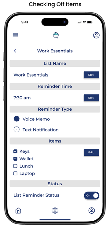
Checking Off Items
Checkboxes make completion clear at a glance
Immediate visual feedback reinforces progress
Large tap targets support quick, one-handed use
Minimal interaction keeps the flow effortless
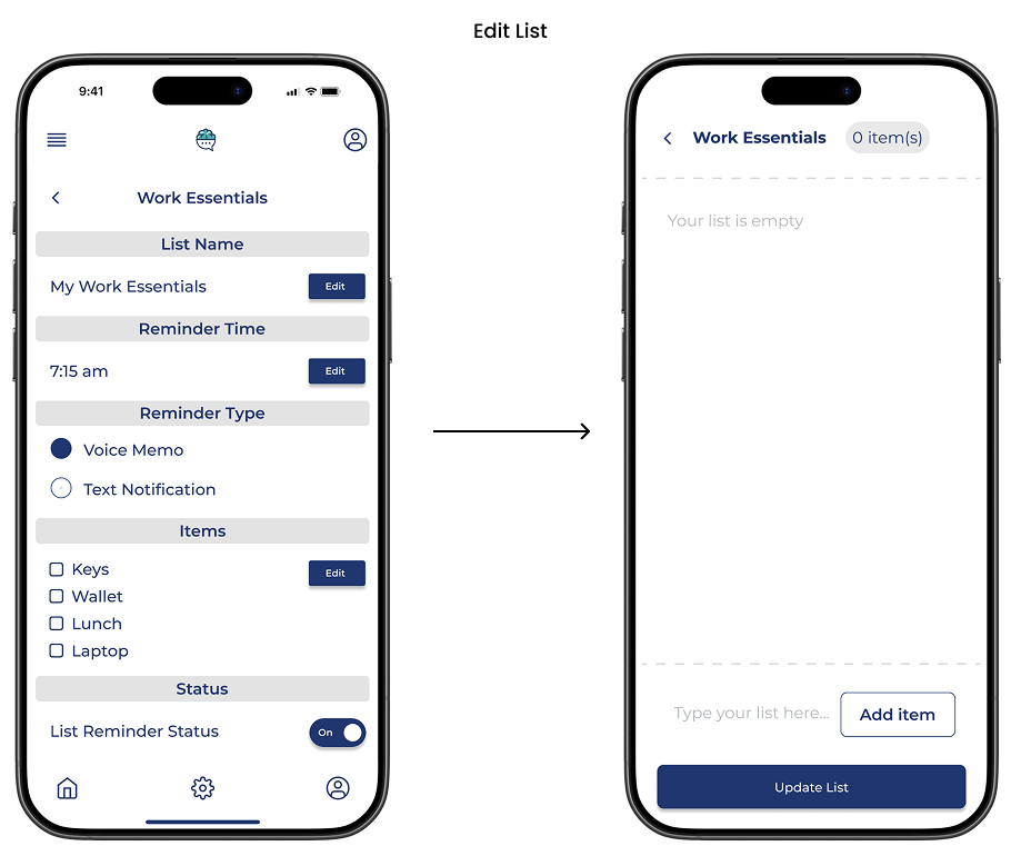
Edit List
Inline editing keeps users in context while making changes
Lightweight item entry supports quick updates
Fixed “Update List” makes saving obvious
Fewer steps reduce friction for busy users
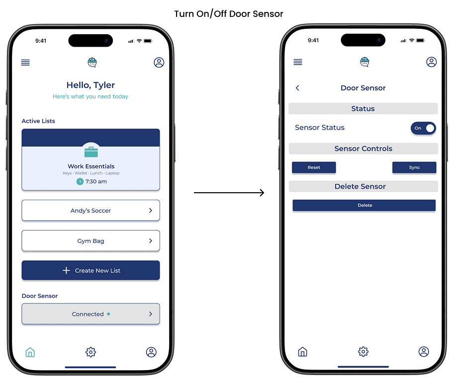
Turn On/Off Door Sensor
Single toggle makes sensor control instant
Clear on/off state reduces uncertainty
Global placement shows it affects all lists
Minimal actions keep control stress free
13
{ ACCESSIBILITY CONSIDERATIONS }
Accessible by Design
High contrast color choices support visibility in bright and low light environments
Large tap targets support one handed and rushed use
Status is communicated through text and icons, not color alone
Simple, plain language supports quick comprehension
Minimal screens reduce cognitive load for distracted users
14
{ EVALUATION & ITERATION }
This project is conceptual, so validation focused on self review, heuristic evaluation, and iterative refinement. Each core flow was walked through to identify friction, unclear labels, and unnecessary steps, then refined to feel fast and low effort.
Flows Reviewed
Create a reminder list
Edit an existing list
Check off items
Turn door sensor on/off
View door sensor status
15
{ REFLECTION }
What I Learned
Designing for forgetful and rushed users requires extreme simplicity
Small reductions in steps have a big impact on usability
Global controls reduce mental load compared to list-level settings
Calm visuals help users feel supported, not managed
Restraint can be as powerful as adding features
What I’d Improve Next
Test how well users notice and trust the door sensor
Validate reminder clarity during real exit moments
Explore different alert styles for varied attention needs