
Designing a Safer Way to Use Debit
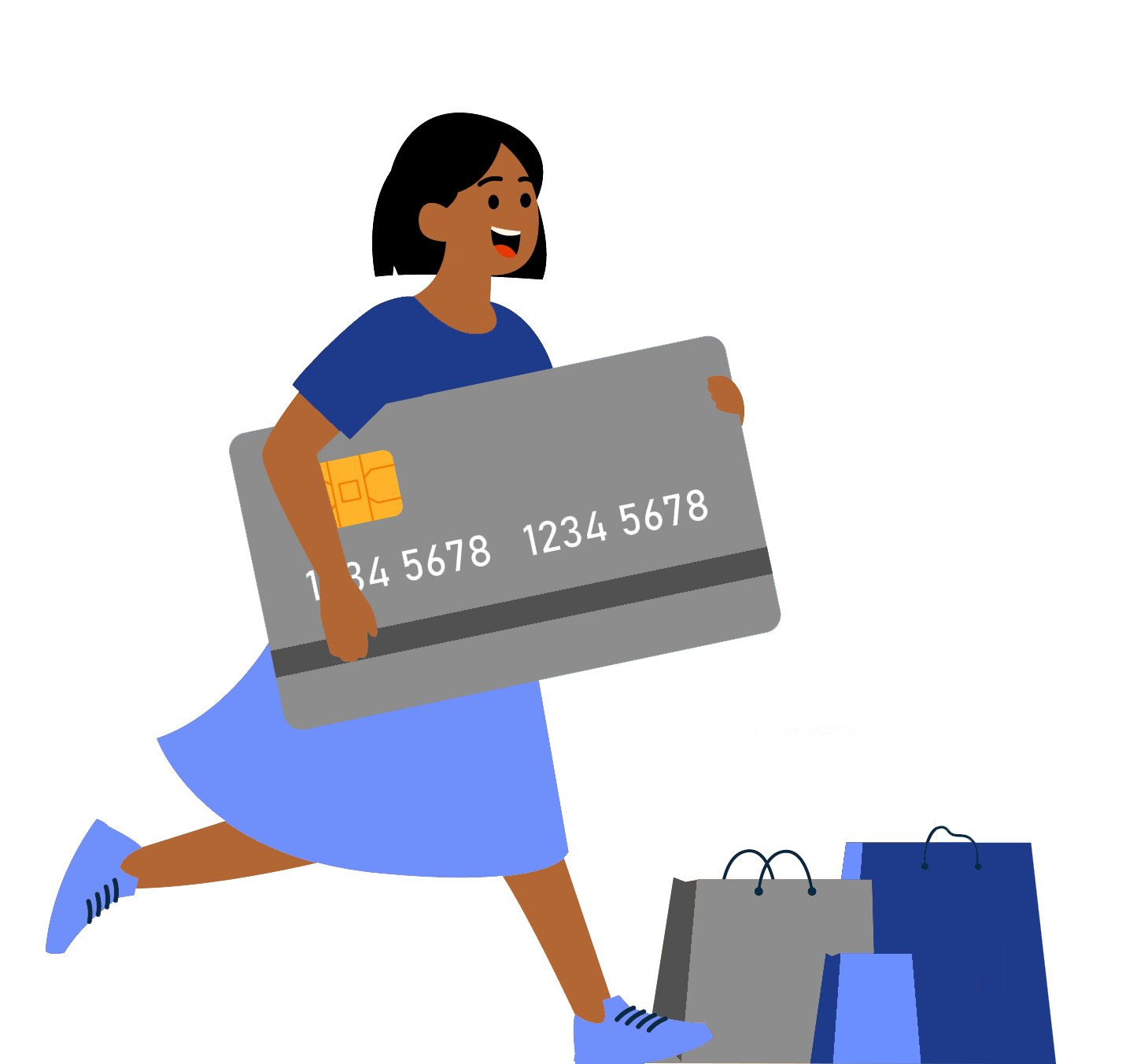
When my aunt’s debit card was skimmed at a gas station and she struggled to get her money back, I decided to design a product that could prevent that from happening in the first place.
This is how BlankPay began.
MY STARTING POINT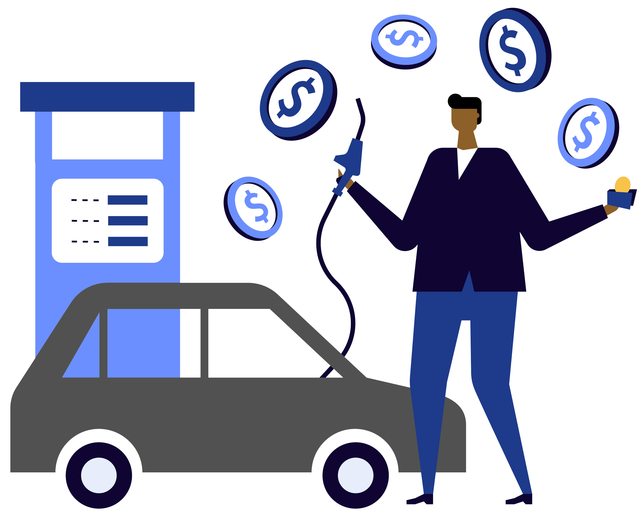
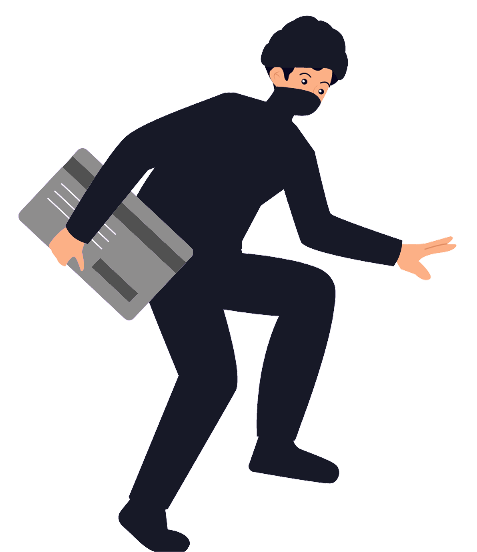
I started digging into how fraud happens at gas stations.
Why does fraud happen there so often? How do skimmers even work? Why does the card stay active after you pay? What if it didn’t? Can protection happen automatically instead of after damage is done?
I wanted to understand why fraud happens at gas stations and whether it could be prevented.
INTERVIEWSTo understand what people actually think about fraud, I went to a local gas station and spoke with five people of different ages and backgrounds while they were getting gas or walking back to their cars.
Some of the questions I asked were: “Have you or someone you know ever been a victim of card fraud?”, “How do you usually pay for gas and everyday purchases?”, “Do you use a credit card or debit card more often?”, and “If your debit card were skimmed, what would that mean for you financially?”

“How concerned are you about fraud?”
—The main question that shifted my thought process during my interviews
Some people answered right away. Some had to think. Some didn’t seem worried at all.
When I stepped back and reviewed the patterns, my understanding of the problem changed.
RETHINKING THE PROBLEM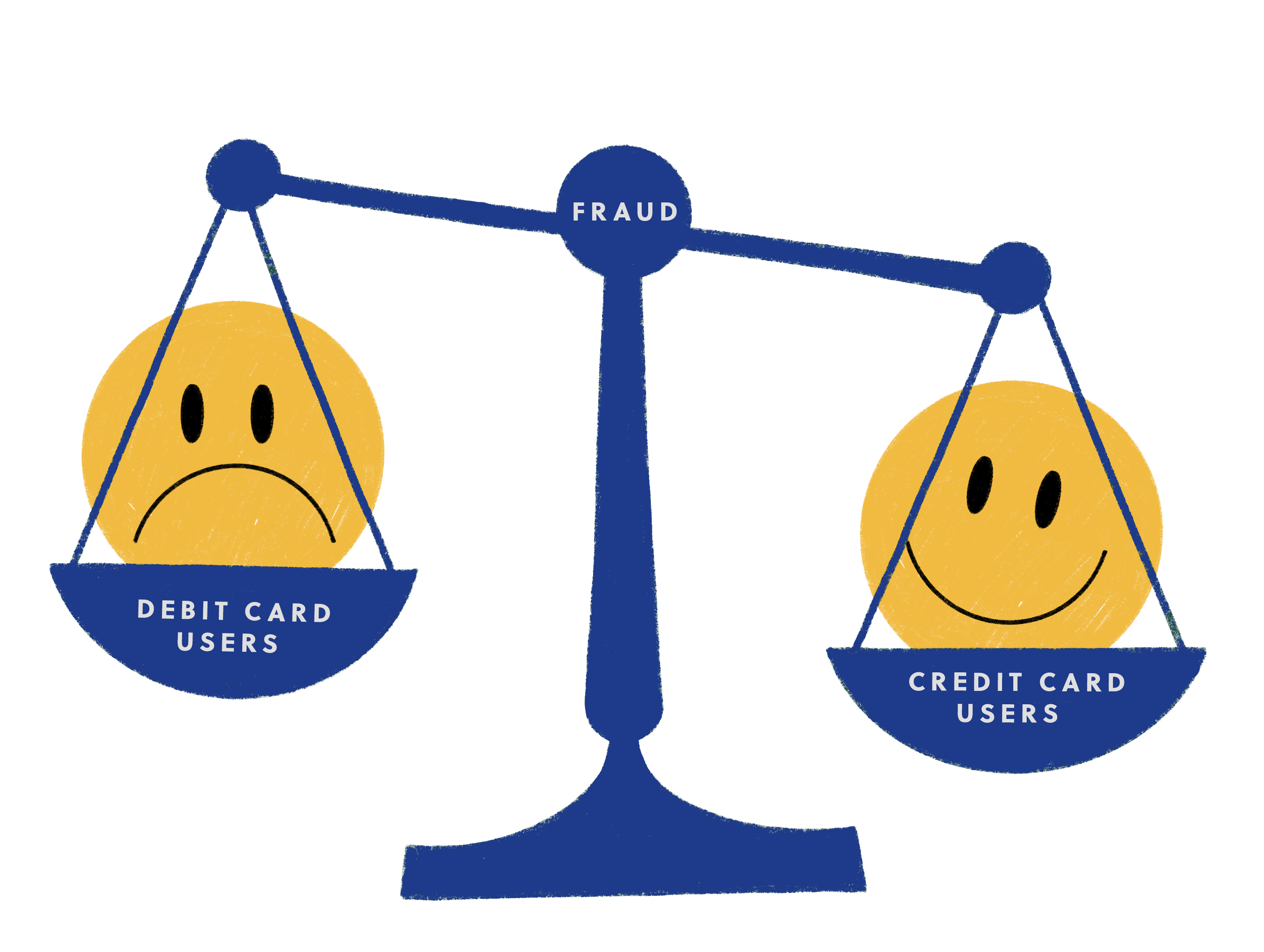
When I analyzed the interviews side by side, one insight stood out: Not everyone fears fraud.
People who relied on credit cards saw fraud as an inconvenience. They trusted they would be protected.
But people who relied on debit described something very different. For them, fraud meant frozen accounts, delayed access to money, and uncertainty around basic needs like rent, gas, and groceries.
The problem wasn’t just fraud.
It was what happens after.
This shifted my focus. The issue wasn’t limited to gas stations — it was about debit users who don’t have the safety net of credit.
They don’t just need protection. They need control and peace of mind in real time.
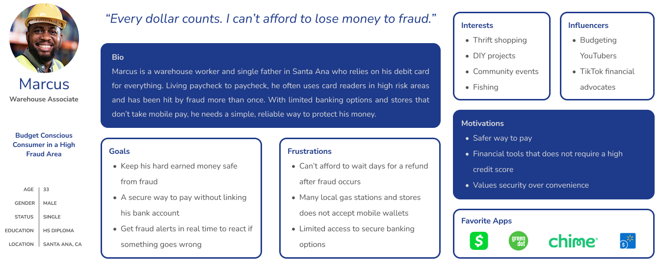
WHO I'M DESIGNING FORWith a clearer understanding of who this problem affects and how it impacts them, I created a persona to keep that user at the center of every decision.
THEIR JOURNEYI mapped out what everyday spending looks like for someone who relies on debit.
Most of the time, it feels normal. They use their card for gas, food, coffee, and small purchases without thinking twice.
Nothing looks wrong. The transaction feels complete.
But this is when risk begins.
If fraud occurs, they don’t find out immediately. They notice later — when checking their balance or receiving a notification. By then, the damage is already done.
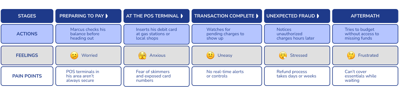
Fixing it is slow. They contact their bank, explain the situation, and wait days for their money to return.
During that time, everyday essentials like gas, groceries, and rent become uncertain.
The biggest loss isn’t just money.
It’s control.
WHERE IT BREAKS“I paid.”
“It’s done.”
—What the user believes
Card stays active.
Risk begins.
—What actually happens
After a transaction, nothing signals risk and nothing gives control. From the user’s perspective, the process is complete
But this is when vulnerability begins.
SKETCHESWith my problem mapped out, it was time to design. I started with rough sketches to explore how someone could control their money in real time. My solution was to design a system made up of two parts: an app and a debit card.
I sketched ideas for locking and unlocking the card, automatic locking after purchases, setting daily limits, viewing transactions, and how the app and the physical card would work together.
I showed these early sketches to a user. They liked the idea of setting a daily limit and locking their card, but one thing stood out: locking the card took too many steps. They wanted control, but they wanted it fast.
That told me protection couldn’t be hidden. I made that one of the focal points when moving into high-fidelity design.
HI-FI PROTOTYPES: GHOSTPAYI turned the sketches into a high-fidelity prototype called GhostPay — an early working name for what would later become BlankPay. I also created an early design for the debit card.
SPLASH SCREEN
LANDING SCREEN
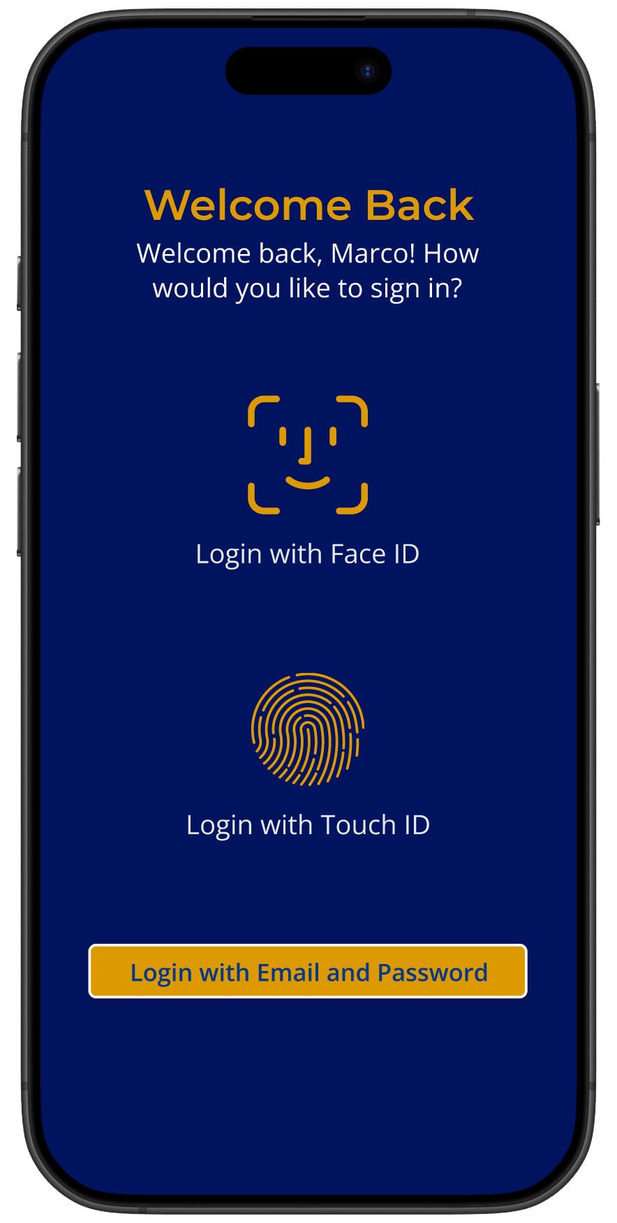
SIGN UP / SIGN IN
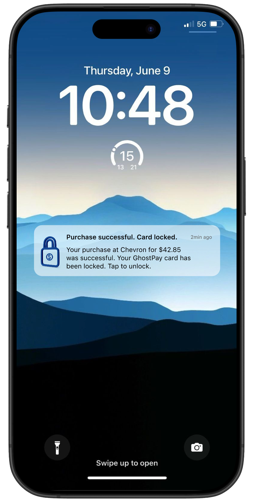
AUTO CARD LOCK NOTIFICATION
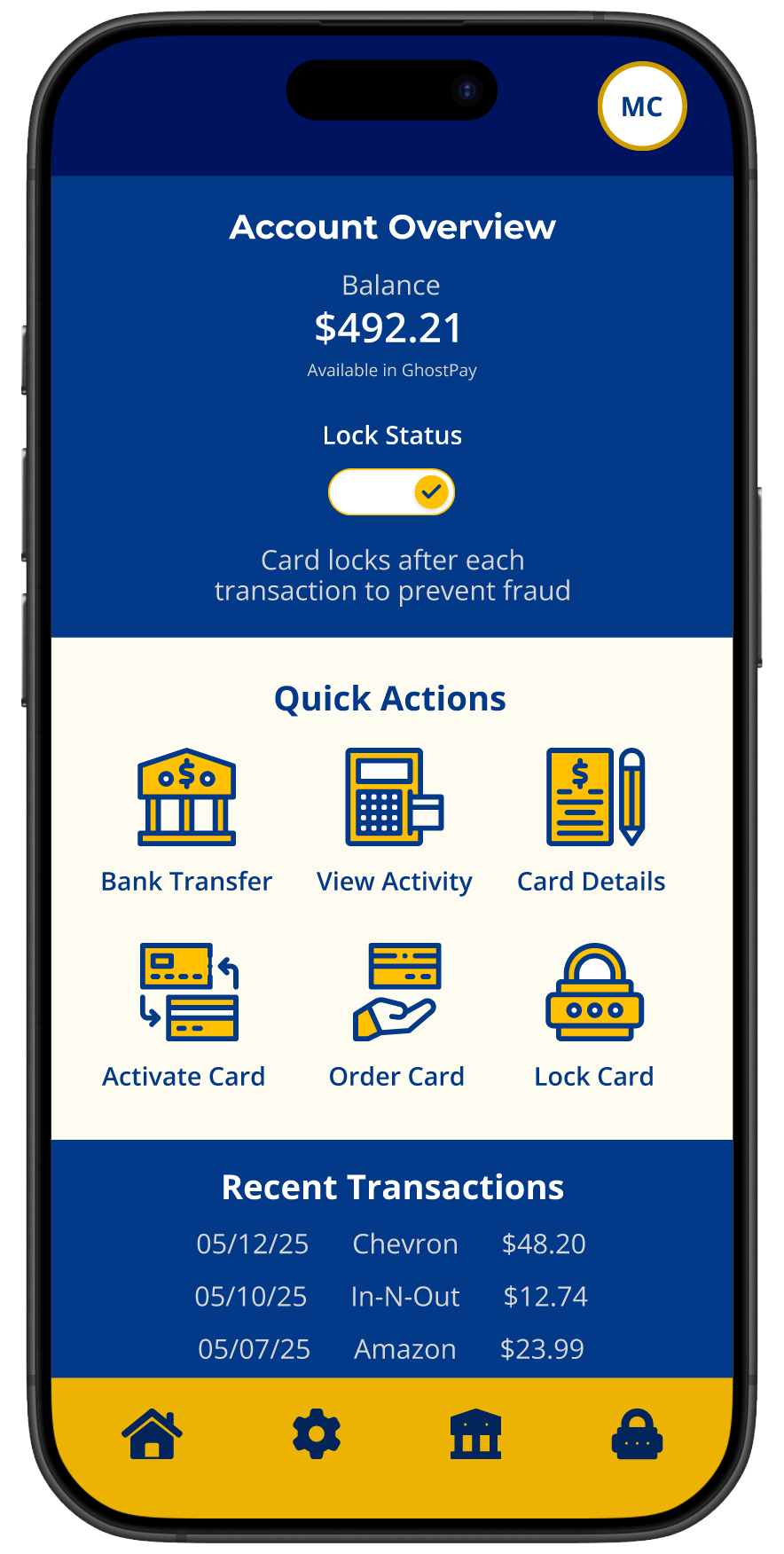
HOME SCREEN
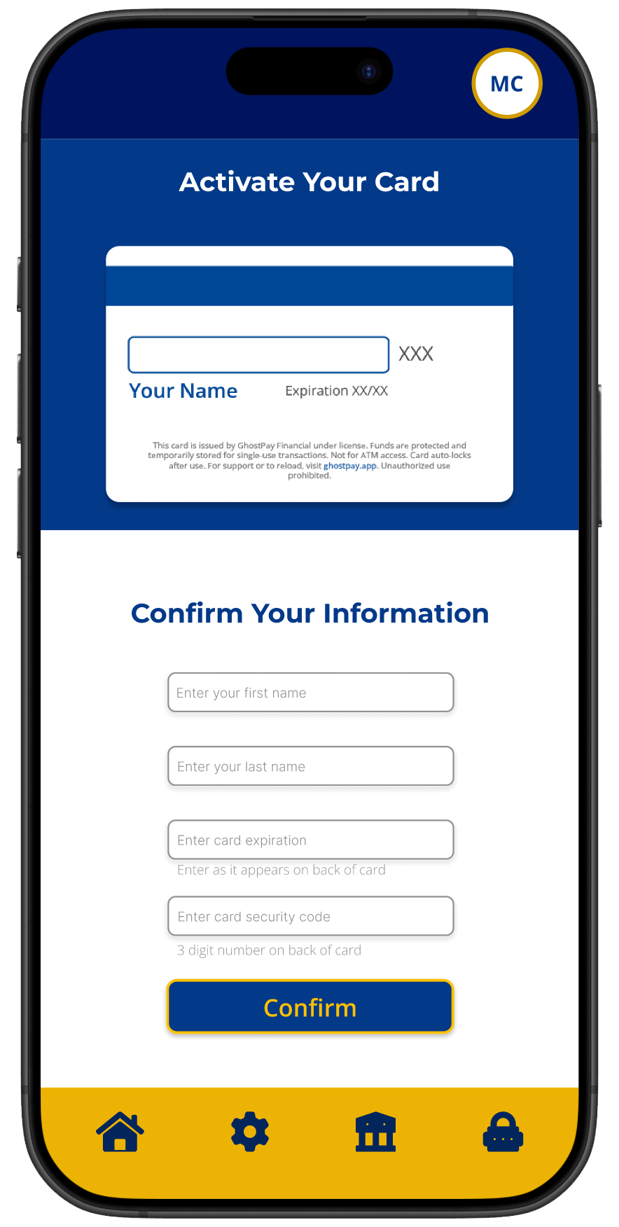
ACTIVATE CARD
TRANSACTION HISTORY
RECENT ACTIVITY
Once the prototype was finished, I reached out to two peers from college who connected with the problem because they relied on debit and worried about fraud. I asked them to try the app.
The feedback was underwhelming. They said:
A lot of screens were too busy and had no breathing room.
It didn’t feel like a real financial product.
The colors were too bold.
After completing actions, they weren’t always sure it worked.
Locking the card still didn’t feel obvious.
They weren’t sure when the card was locked or if it had locked automatically after a purchase.
That told me the idea was there, but the experience wasn’t.
RETHINKING THE EXPERIENCEOld name and logo
I went back to the drawing board with clearer goals:
Make locking the card and automatic locking after purchases the most visible behavior.
Make every action feel clearly complete.
Make the design feel calm, safe, sleek, and trustworthy.
Make the design simple and breathable.
Make the card and app feel like one system.
I also came up with a new name — one that embodied the sleek, calm and trustworthy experience I envisioned: BlankPay.
New name and logo
MAPPING THE NEW EXPERIENCEUser flows helped me identify key actions, decision points, and moments where users might hesitate or feel unsure. This allowed me to simplify the experience, prioritize safety related actions, and create a layout that feels predictable and controlled.
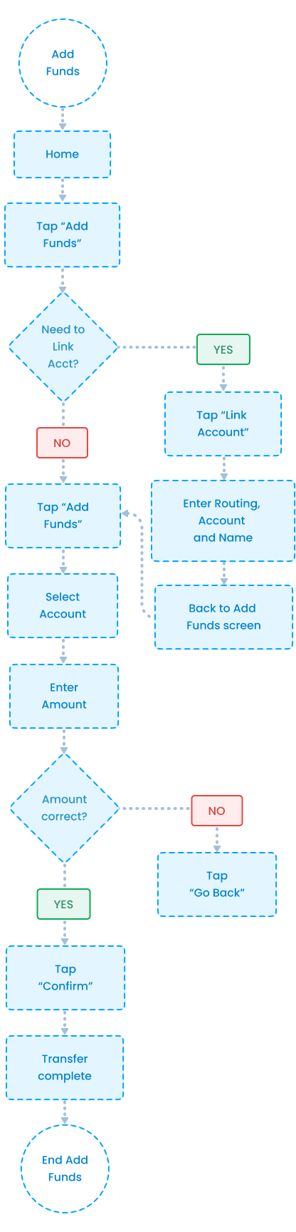
ADD FUNDS
VIEW TRANSACTIONS
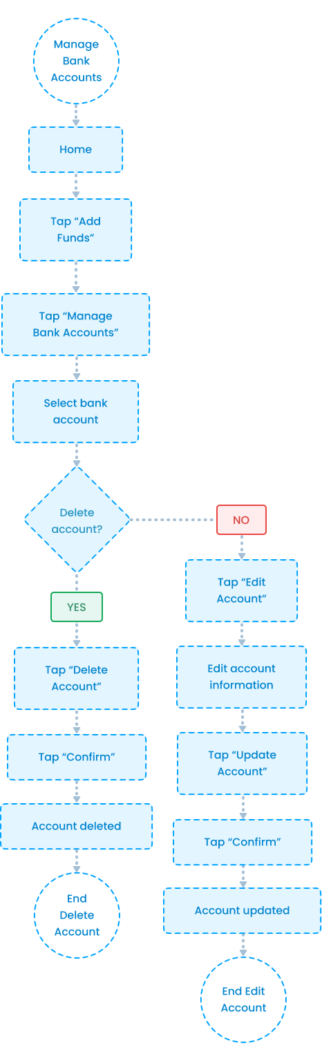
MANAGE ACCOUNTS
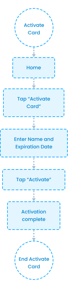
ACTIVATE CARD
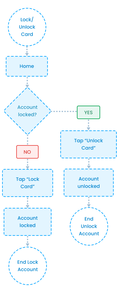
LOCK/UNLOCK CARD
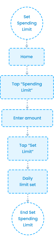
SET SPENDING LIMIT
MID-FIDELITYMid-fidelity screens helped me focus on structure, clarity, and flow before visual styling.
I used this stage to test spacing, hierarchy, and how easily users could understand what to do next.
HOME DASHBOARD
CARD LOCKED / UNLOCKED
VIEW TRANSACTIONS
ADD FUNDS / LINK + MANAGE ACCOUNT
ACTIVATE CARD
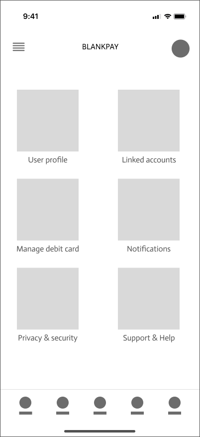
SETTINGS
THE FINAL PRODUCTONBOARDING
A branded splash screen followed by three value focused screens that explain how BlankPay stays secure by default. Users can then create an account or sign in.
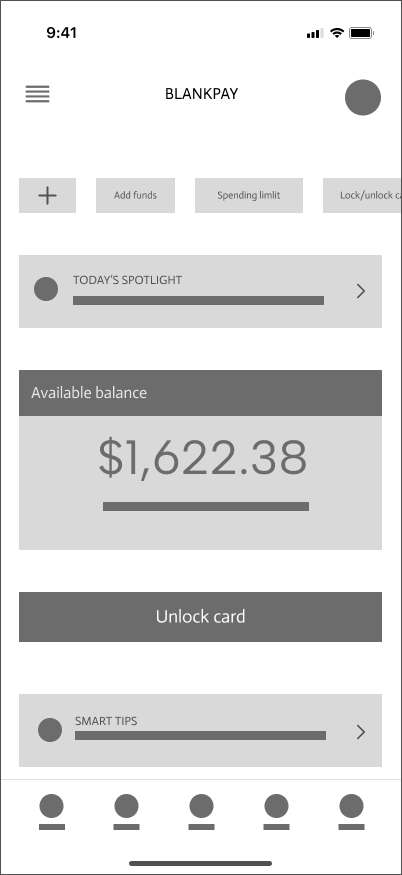
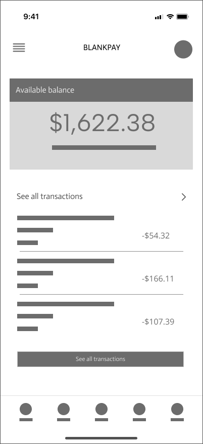
HOME SCREEN
A centralized view of balance, card controls, quick actions, and ongoing security activity designed for fast, confident use.
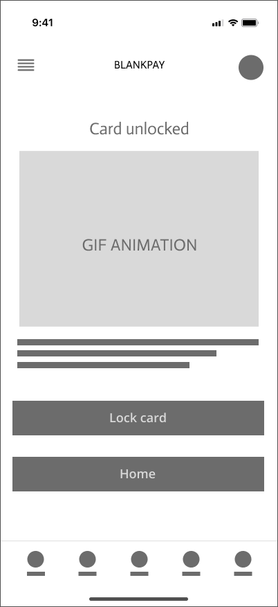
LOCK/UNLOCK CARD
A primary lock control paired with immediate visual feedback reinforces that the card state has changed.
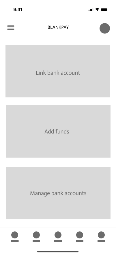
ADD FUNDS
Users can select a saved bank account and confirm the amount before funds are added, with clear feedback confirming a successful transfer.
VIEW TRANSACTIONS
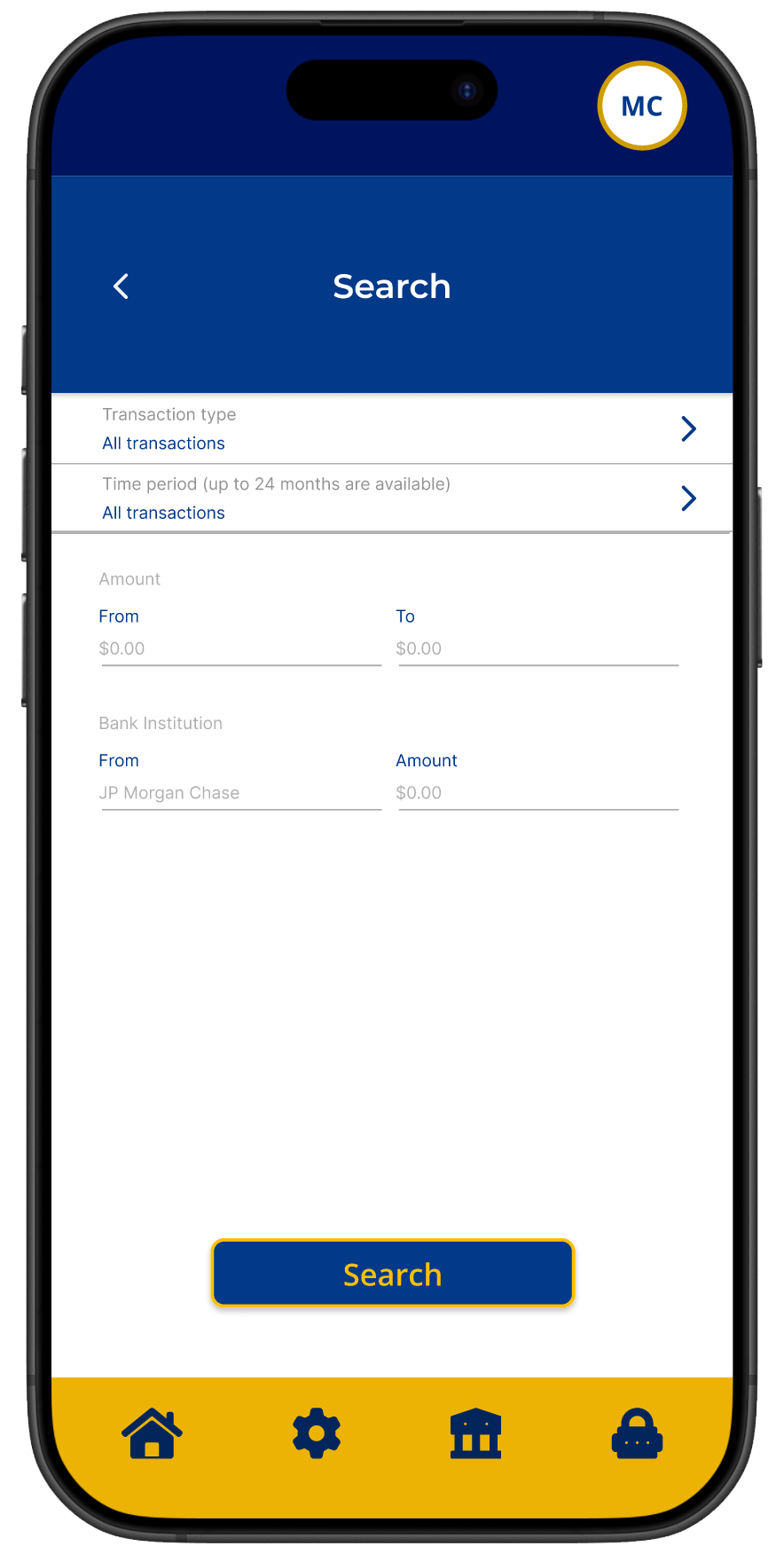
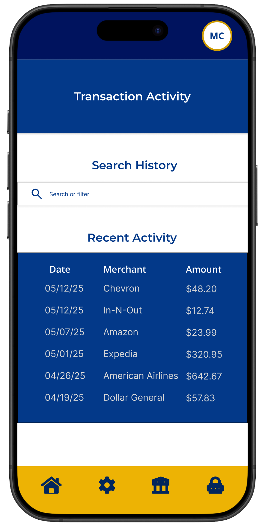
A clear transaction history allows users to review purchases and credits, with filters for type, time frame, and amount.
SPENDING LIMIT
Users can set a daily spending limit with a confirmation step and clear feedback once the limit is applied.
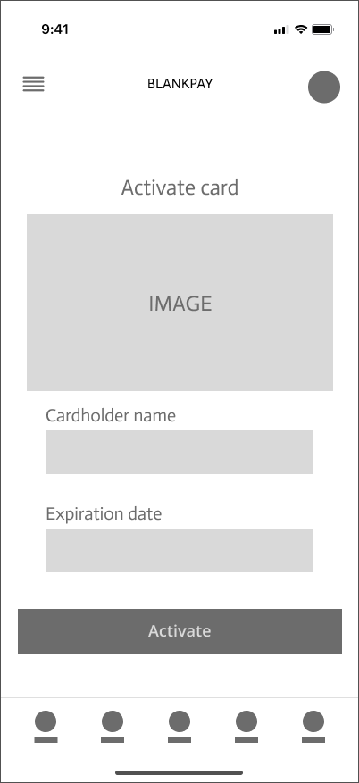
ACTIVATE CARD
Users activate their card by entering the cardholder name and expiration date, with clear confirmation once activation is complete.
CARD LOCKED NOTIFICATION
After a transaction is completed, users receive a confirmation that the purchase was successful and the card has automatically locked.
Together, these interactions make security feel clear, automatic, and trustworthy throughout the experience.
TESTING AGAINI went back to the same two peers and asked them to try BlankPay. I told them I had taken their feedback seriously.
Their reactions were completely different. They said locking the card felt fast and obvious. They always knew when something worked. They understood when the card locked automatically after a purchase. And the design felt secure and more trustworthy.
IMPACTFraud doesn’t start when money is taken.
It starts the moment a transaction ends and the card stays active.
BlankPay changes that.
Instead of waiting for something to go wrong, the card locks automatically after every purchase, giving users control the moment risk begins.
WHAT I LEARNEDUnderstanding the problem isn’t enough. I needed to understand how it affects people in real life
The most important feature should never be hidden. It should be obvious and easy to use
Simplicity builds trust, especially when people are dealing with their money
Feedback only matters if you’re willing to step back and rethink your decisions